

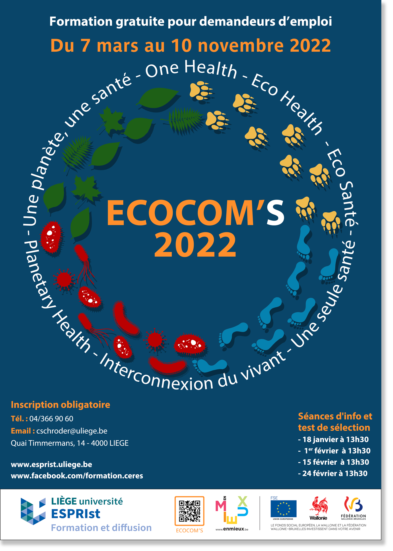
ECOCOM'S trains jobseekers in the field of environmental and health communications.
This training program revolves around the One Health movement, which brings a global vision of health to humans, animals and the environment.
. ESPRIst also integrates micro-organisms.
Like its Bag'Age training program, ESPRIst wanted to create a common visual identity for all its media.
This visual identity had to include :
- A logo
- A poster
- A promotional video
- Flyers
- A template for PowerPoint presentations
- Written documents (letters, trainee handouts, etc.)
The circle shape refers to the interactions and impacts between the elements of One Health.
The circle also symbolizes planet Earth and the fact that we all live in a limited space.
Symbols and colors directly refer to each actor: a green leaf for nature, yellow paw print for animals, etc.

![]()

![]()
The colors were taken from the color codes of photos representing each element:
- Savannah for animal yellow,
- Treetops for nature green,
- Planet Earth for human and for the background representing space
- Image of red blood cells for micro-organism red.
The colors of the title come from the "orange and teal" concept, by using the color opposite of the blue color from the background: orange.


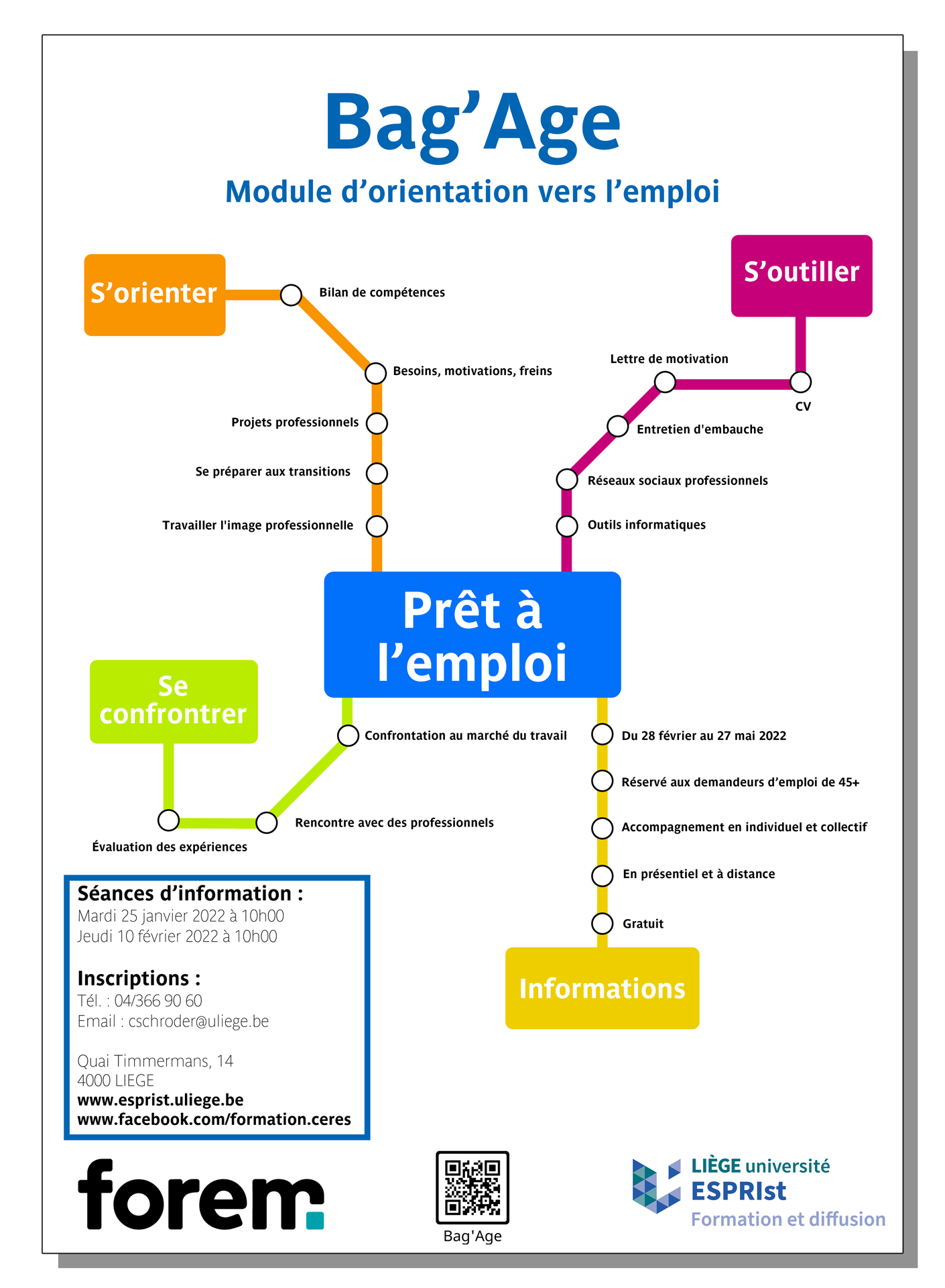
Bag'Age is a program set up by ULiège's ESPRist - Formation et Diffusion center (formerly CERES).
This module focuses on jobseekers aged 45+ who are looking for a career change.
To maintain consistency across all the module's media, ESPRIst wanted to create a visual identity comprising :
- A logo
- A poster
- Flyers
- A template for PowerPoint presentations
- A specific look for each type of document (letter, file, etc.)
The idea is to create a course whose modules bring to a new quality.
The "Metro" theme reflects the idea of progression, with stations that develop a skill.
The theme also allows for a clean, clear design that makes the poster easy to read.
![]()
The font is Parisine, the official font of the RATP (Régie Autonome des Transports Parisiens), the public transport operator of Paris.

The colors are the same as those used for RATP and STIB metro signs, the Brussels equivalent of RATP.
The network lines and their angles are directly inspired by STIB and RATP maps.


